OpenSearch Dashboards are a powerful tool for visualizing and interacting with your OpenSearch data. With version 3.0, new features and enhancements have made it easier than ever to create, customize, and use dashboards for better data-driven decisions. Whether you’re a beginner or looking to level up your skills, this guide walks you through everything you need to know about OpenSearch Dashboards, from setup to visualization.
You can follow along in one of two ways:
- Sign up for the NetApp Instaclustr free trial and spin up an OpenSearch 3.0 preview cluster: Instructions for spinning up an OpenSearch cluster can be found here, just change the OpenSearch version to 3.0 (Public Preview)—you may need to scroll down in the version list dropdown:
(Note: You’ll populate your cluster with sample data in a later step.) - You can use the OpenSearch playground—it has all the data pre-populated that you’ll need.

Picture of the NetApp Instaclustr cluster creation screen, with OpenSearch 3.0 selected
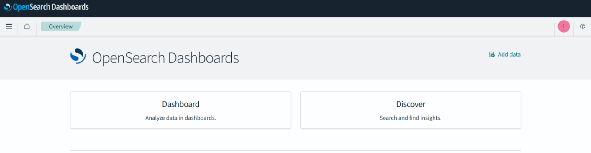
When you navigate to your OpenSearch cluster and login or go to the playground cluster, you’ll be greeted with two giant buttons: one for Dashboards, one for Discovery. Discovery is outside the scope of this article but think of it as a query builder for OpenSearch data.
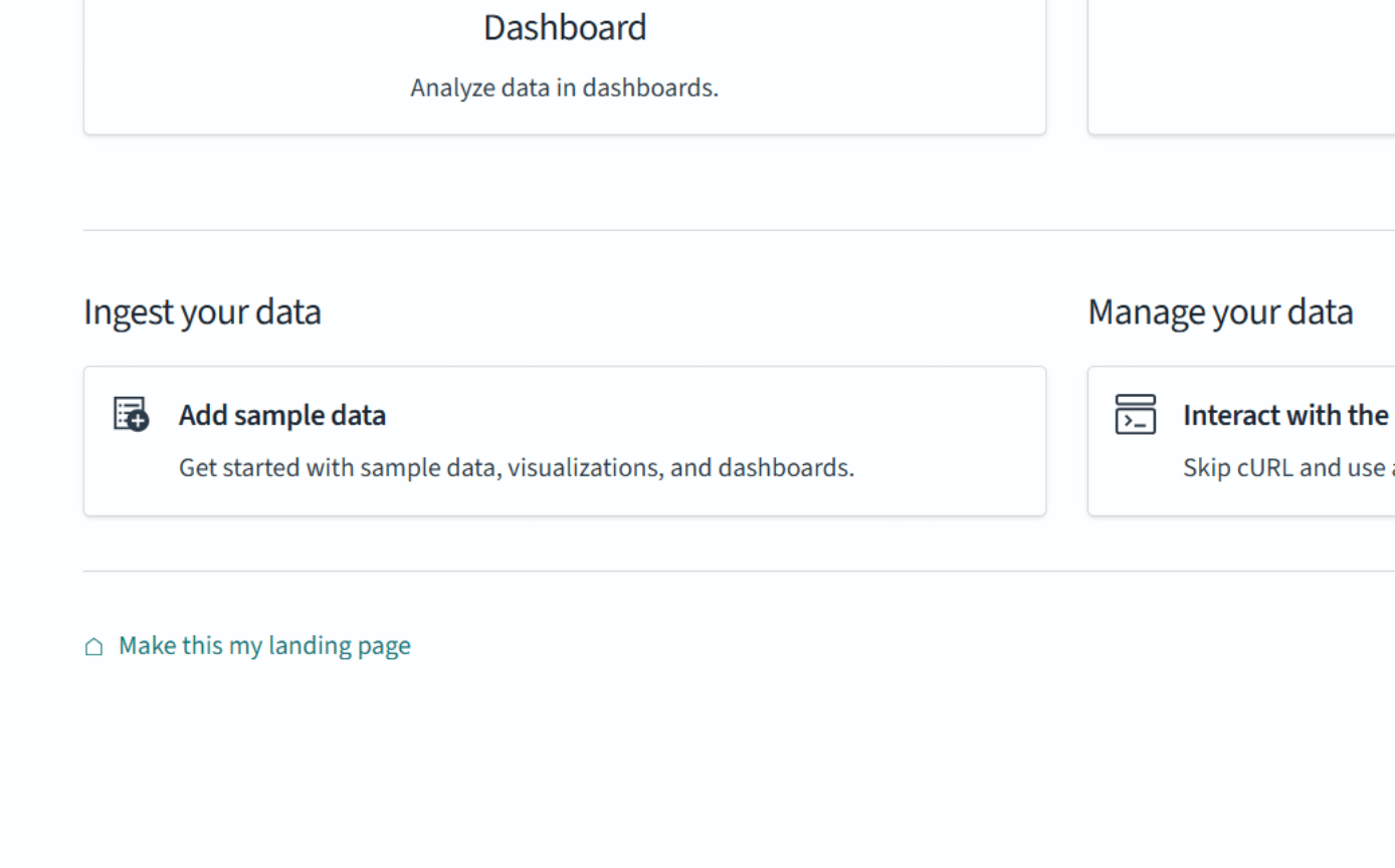
Below are options to populate data on your OpenSearch cluster. If you’re using Instaclustr-hosted OpenSearch, you’ll want to click ‘Add sample data’ on the bottom left:
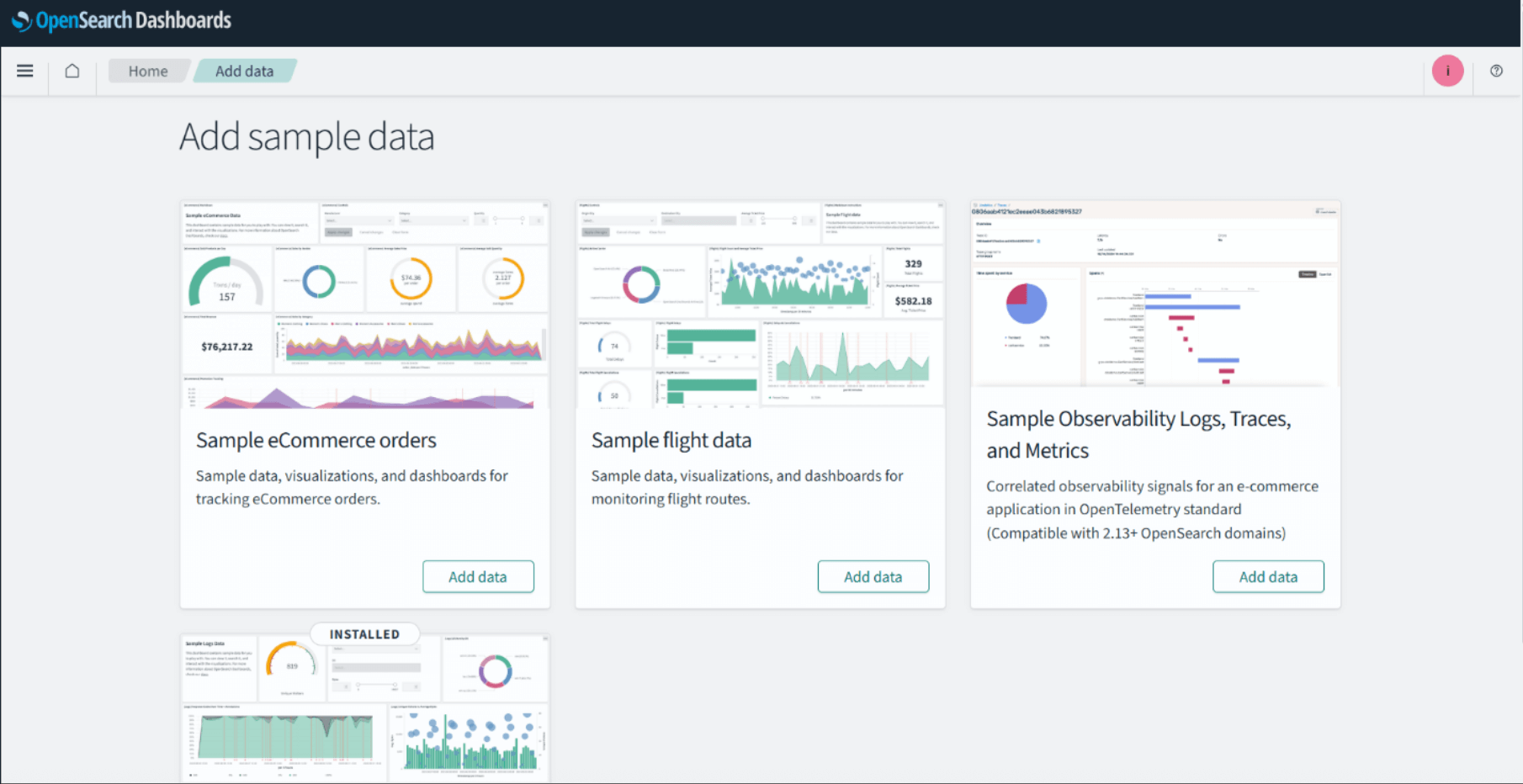
The following screen will appear, which offers a few different test data sets:
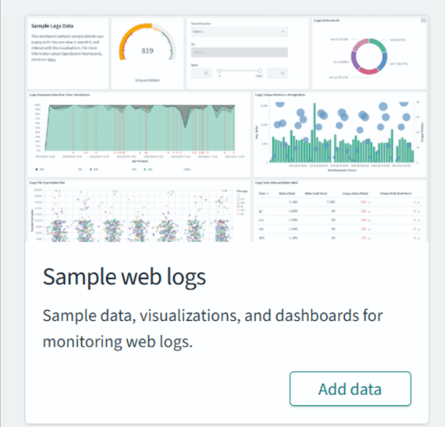
Scroll down to the ‘Sample Web Logs’ data set and click the ‘Add Data’ button:
Once it’s done, click ‘View Data’ and you’ll be greeted with an OpenSearch Dashboard:

To get to this page on the playground, when you click ‘Dashboard’, you’ll see a list of Dashboards:
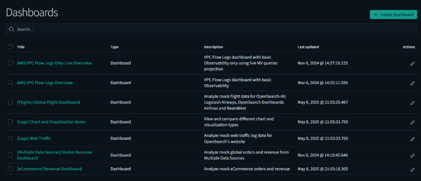
Click on [Logs] Web Traffic to see the same dashboard.
What is an OpenSearch dashboard?
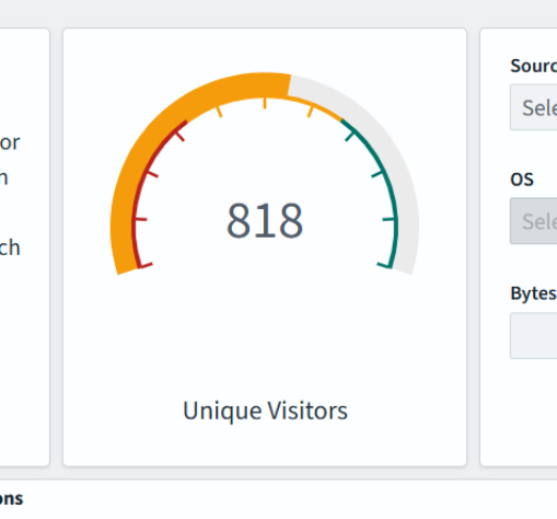
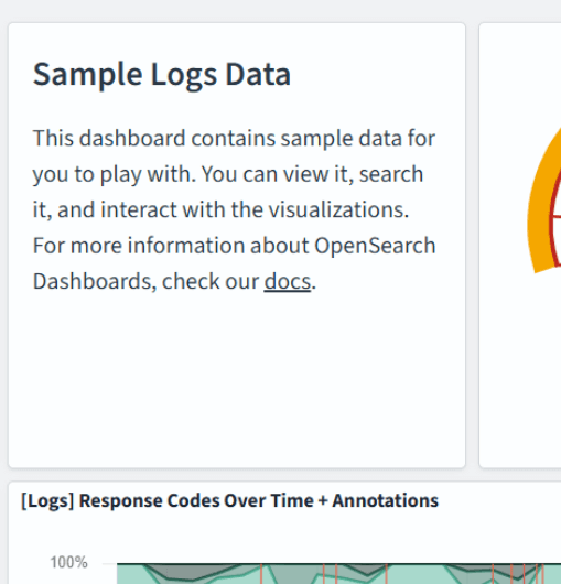
It may look like an overwhelming amount of information at first, but OpenSearch Dashboards can be broken down into components called Panels. Panels contain visualizations of your OpenSearch data:

Metrics:
Markdown test:
And a control panel (newly added) that allows you to manipulate the dashboard from the UI:
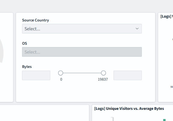
Try playing with the controls in the panel to see how they change the visualizations in real time.
Now that you’ve learned about the panels of a Dashboard and played around with a visualization panel, it’s time to make your first dashboard.
Making your own dashboard
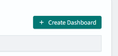
On the Dashboards page (you can click ‘Dashboards’ in the upper left corner to get there) you’ll click the ‘Create Dashboard’ button in the upper right corner:
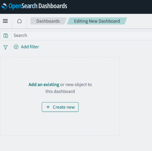
This will take you to a blank dashboard, where you’ll click the ‘Create New’ button in the dashboard:
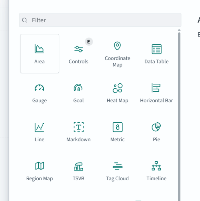
In the pop-up window that comes up, select the ‘Area’ chart.
Then for the data source, select opensearch_dashboards_sample_data_logs.
Note: if you are using the playground there will be multiple sources in this list.

Once you’ve chosen your source data, you’ll be taken to the visualization editor screen:
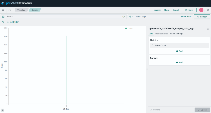
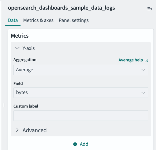
Now this doesn’t look very informative. To enhance this, you’ll add to the Metrics and Buckets boxes on the right side of the screen. Think of them as your Y and X axis data buckets, respectively. To start, in the Metrics window, click the arrow next to ‘Y-axis count’ and change the aggregation from count to average. Then, change the field to ‘bytes’. It should look like the following:
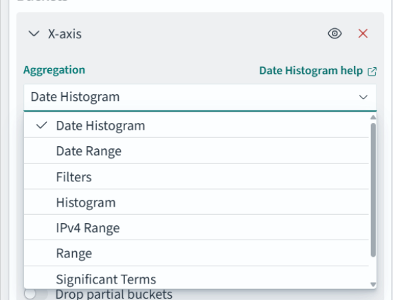
Now you’ll add a date histogram to the ‘Buckets’ section. To do so, click the ‘Add’ button in the Buckets pane. You should see something like this:

Click ‘X-axis’. You’ll see an Aggregation dropdown, select ‘Date Histogram’ from the list:
Leave everything else on default. At the bottom right of the screen, hit the ‘Update’ button to update with the new data buckets:

Now that’s a graph! Hit ‘Save’ at the very top right of the page to save your visualization and, after giving your visualization a title (I used ‘Average Bytes over Time’), hit Save to return to the dashboard with your new area chart:

Next, you’ll create a control to manipulate the data in the area chart you just created. Click ‘Create New’ in the dashboard to create a new panel, and when selecting a type select ‘visualization’. For this panel, use the Controls type:

You’ll be greeted with the same style of editing screen with different options:

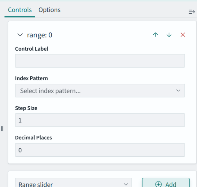
You’re going to add two controls: one for request byte size and one for request country. First, the request byte size slider: under ‘Controls’ in the right pane, select ‘Range Slider’ in the dropdown, and select the ‘Add’ button to the right of the dropdown.
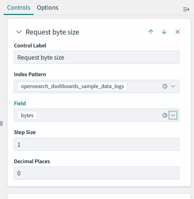
Fill out the form: for ‘Control Label’, I put ‘Request byte size’, for the index pattern I selected the opensearch_dashboards_sample_data_logs data set. Then for Field, put ‘bytes’:
Click ‘Update’ at the bottom of the page to see the slider:

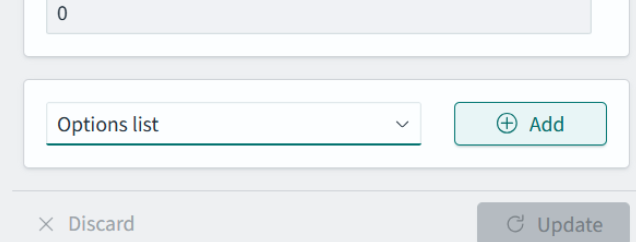
You can now filter out requests based on their size in bytes. Now you’ll add a dropdown to select the country the request was from. To start, in the right pane, look at the bottom of the pane for the ‘Add’ button, and in the dropdown to the left of it, select ‘Options List’ and click the ‘Add’ button.
You’ll see a few options for this Options List object:
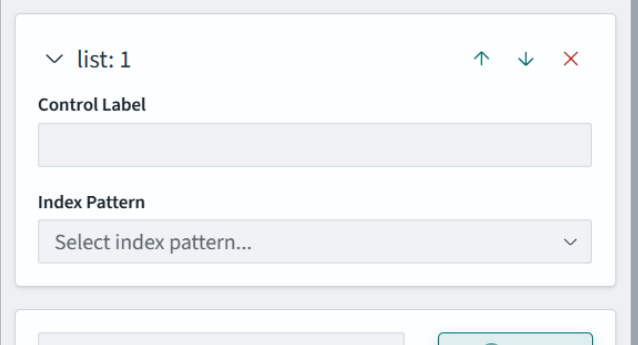
For ‘Control Label’, put “Request Origin Country”, and for index pattern, select opensearch_dashboards_sample_data_logs, and for field, select geo.src. Hit Update in the lower right corner to see the new control:
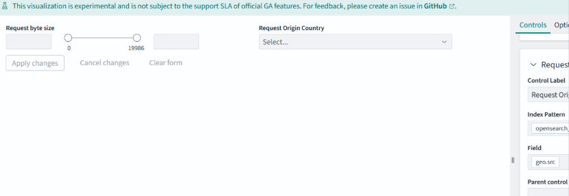
Hit ‘Save’ in the upper right corner of the screen twice; once for the control panel and once for the dashboard itself. You’ll be taken to your new dashboard:
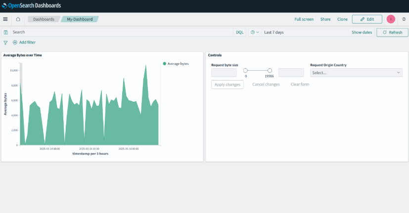
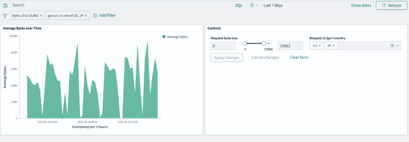
Play around with the controls, and hit ‘Apply Changes’ in the control panel to make changes to the visualization on the left:
Wrapping it up
OpenSearch Dashboards are a gateway to making your data more accessible, interactive, and actionable. From setting up your first dashboard to mastering advanced controls, OpenSearch 3.0 empowers users to visualize data like never before.
Don’t wait to leverage these powerful features. Start exploring OpenSearch Dashboards today with the NetApp Instaclustr free trial or OpenSearch playground and unlock key insights from your data. Plus learn more about the OpenSearch 3.0 release on the NetApp Instaclustr blog.